On a dashboard, a time series block with 24 hours time range is displayed with one X-axis label every 24 hours. Typically, there are only two labels appearing on the X-axis.

It’s more reasonable to display one label every few hours. The density should depend on the width of the plot. For example, a 2-column plot on a desktop can have one label every 3 hours, while a plot on a 4-inch phone in portrait can have one label every 8 hours.
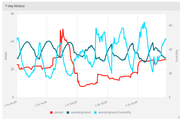
Similarly, a time series block with 7 day time range is displayed with one X-axis label every 7 days. It’s better to have one label every 1 or 2 days.