Is there a good example making a custom graph block with data coming from a table query?
I can’t get anything to display other that the x and y axis.
Are you just trying to make a time series graph? Can you provide some simple example data you’d like to display?
Can you see my test graph on dashboard Energy ?
I’m not a member of your organization so I can’t see the dashboard. I wouldn’t necessarily recommend adding me to the organization based on your data security needs. If you can paste a couple of example rows with fake data, I can use that to base a graph on.
I have a very simple data table with just 3 records as follows:
Record1: Xvalue=1, Yvalue=2
Record2: Xvalue=2, Yvalue=4
Record3: Xvalue=3, Yvalue=6
I can’t even get that to work. so I must be missing something completely.
I created a Data Table from your example data. I named it “Entries”.

For the dashboard block data query, I selected the “Entries” data table and left the query fields blank, which means it will return all data from that Data Table.

Here’s the Vega-Lite configuration that will plot these as bar charts:
{
  "width": {{block.width}},
  "height": {{block.height}},
  "autosize": {
    "type": "fit",
    "contains": "padding"
  },
  "config": {
    "axis": {
      "labelColor": "#888c95",
      "titleColor": "#888c95",
      "domain": false
    },
    "legend": {
      "labelColor": "#888c95",
      "titleColor": "#888c95"
    },
    "view": {
      "fill": "#414855",
      "stroke": "transparent"
    }
  },
  "data": {
    "name": "data-table-0"
  },
  "mark": "bar",
  "encoding": {
    "x": {
      "field": "xValue",
      "type": "quantitative"
    },
    "y": {
      "field": "yValue",
      "type": "quantitative"
    }
  }
}
The important sections are the data.name property, which should match the Query Name provided in the Queries section. In this example, I left it the default name, which is data-table-0. The next important fields are encoding.x.field and encoding.y.field. These should be set the column names in the Data Table, which are xValue and yValue in this example.
The colors in the config section are used to make the graph look better on the dark theme.
This configuration results in the following block:

I’ve also sent you an invite an application in our Losant Examples organization where this is implemented. So feel free to jump in there and check it out.
Thanks,
I think I figured out what I did wrong.
My real table had the Xvalue as a string (containing minutes) but the format was nn:nn:nn , so nothing showed up.
My current source file I would like to use contains date (as: 12/10/2018) and time (as 21:05:00) as two separate fields. Do I have to combine it in to one date/time field before import to table or can it be combined within Vega?
That’s a good question. Vega has a concept of transforms that are likely what you’d used to combine the fields, but I don’t have much experience with those. I’ll see if I can figure it out.
If not, how should the time stamp be formatted for a time series data point?
Vega-Lite will understand dates in ISO format:
Generally I prefer the simplified ISO format, which is also what Losant returns from time-series queries:
2011-10-10T14:48:00
I got it kind of working. Since the date format “MM/DD/YYYY” can’t directly be parse, you can’t coerce it easily into a date, which means you lose some functionality. If you can reformat the date before storing them, things will be much easier.
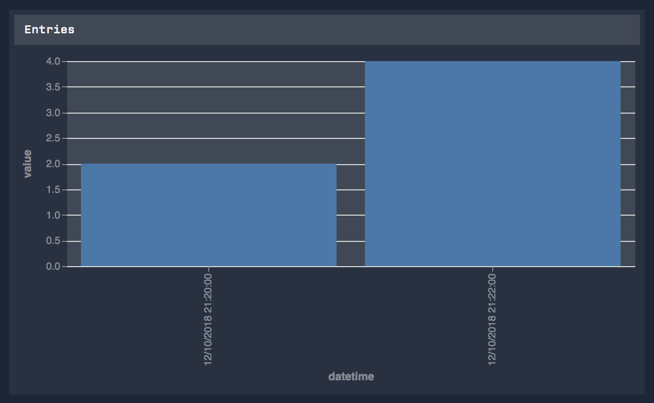
Anyways, here’s a transform that simply combines the date and time columns into a single string and uses that as the X axis. First, here the Data Table:

Here’s the config:
{
  "width": {{block.width}},
  "height": {{block.height}},
  "autosize": {
    "type": "fit",
    "contains": "padding"
  },
  "config": {
    "axis": {
      "labelColor": "#888c95",
      "titleColor": "#888c95",
      "domain": false
    },
    "legend": {
      "labelColor": "#888c95",
      "titleColor": "#888c95"
    },
    "view": {
      "fill": "#414855",
      "stroke": "transparent"
    }
  },
  "data": {
    "name": "data-table-0"
  },
  "mark": "bar",
  "transform": [
    {"calculate": "datum.date + ' ' + datum.time", "as": "datetime"}
  ],
  "encoding": {
    "x": {
      "field": "datetime",
      "type": "ordinal"
    },
    "y": {
      "field": "value",
      "type": "quantitative"
    }
  }
}
Here’s the resulting graph:
Thank you so much for your late hour support. I got it show pretty good now.
Now to the next hurdle.
My imported table data has about 20 values sampled every 2 Seconds.
Dashboards graphs is able to show a graph for about 1.5 hours, but forward/rewinding doesn’t seem to work. Do I have control over that? (Time stamps in table are from November)
You can kind of control that. In the Vega configuration, you have access to {{ block.time }}, which will be the time the dashboard is set to, so if you use the rewind control, that variable will update.
You can combine that with a filter transform to only show data from that time minus 1.5 hours.
ok, so any tim graph by default is limited to 1.5 hours? or number of data points?
I just added another field called “yValue2” that would contain a second series of data point.
I’m struggling being able to show both lines in the same graph.
Here is a post where I helped another user do something similar in the Vega-Lite chart - combining two data sets into one.
Thanks.
I got it to work using a layered graph.
Not sure when I should use layered vs transform?
I guess the example I sent you would be better for comparing two values from two different data segments; in your case, if you want to display two separate lines / bars / etc. inside one dashboard block, then yes, the layered graph would be the way to go.